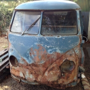
Rear End Done

The rear end is done and the bodywork is nearing completion so I'm slowly turning my thoughts to what comes next...
Bodywork Progress
As the bus is progressing along I'm starting to get a bit excited that bodywork is nearing completion and that I should really start looking at what needs to be done next. I've already sourced some wheels (not the red ones in the photos) and have a gearbox and straight axle setup ready to go in from my 15 window. So maybe over the xmas break I'll look at putting a narrowed beam and some flipped spindles together. Which only really leaves a whole bunch of shits and bits like loom, petrol tank, rubbers and bright-ware. Guess I need to get searching for those parts.
The latest progress has been around the rear end of the bus. The massively dented in rear quarters have been straightened up, the rear hinge panel has had a new inner grafted in and the rear hatch has been replaced with one that was a little less rusty which on balance was less $$'s than fixing up the one that came with the bus. Fortunately I was able to source an original paint Dove blue patina hatch which should blend in nicely once the OG paint is exposed. (Thanks Joe).
I also had to steal the brakelight decklid that I had set aside for the 15 Window as the one I had was just too far gone. It's also Dove Blue. But it does mean that now I've got a bunch of parts that I need to source for the 15 Window.


Logos
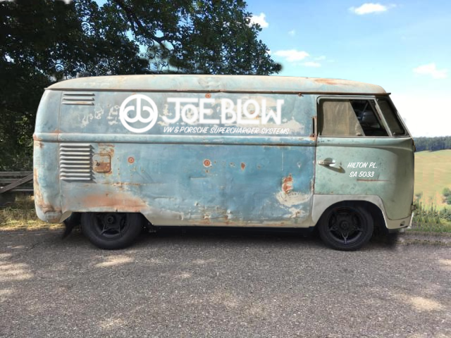
The other thing I've been contemplating is how to do the logos. The plan all along with the bus was to use it as a promotional vehicle for the business, which means getting it sign written in a sympathetic way with hand painted sign writing in a period style aged to fit in with the general patina and look of the bus. As we already have a company logo and typeface, it makes sense to use these as they are. But other text might look better done in a typical sign writers font of the period. This of course is really hard to decide as when I make a mockup photoshop image - to me, it just looks modern. But looking at other signwritten busses of the period shows that there are plenty of companies that had equally modern looking logos and typefaces. (Yes I did flick through the 400+ page thread on thesamba). I think that what I really took away from that thread was to keep the signwriting simple. White logos and writing over the dove blue is pretty iconic and very typical of early busses and might be the key to making it look like the signwriting is contemporary with the bus's age.
Some might note that there are already existing logos on the bus, these are pretty faded and unrecognisable. Removing the top layer of paint also removes any trace of the logos as they seem to have been painted in non-automotive paint over a previous repaint, so they are pretty much impossible to uncover and retain. This is a bit of a shame, as original logo'd busses are alway nice. but I do plan to retain and touch up a few of the parts that I could make out, like the axle weight markings. So there will be a small homage to the original logos.
I think I really need to get the bus back and uncover as much of the original Dove Blue as I can before making the final decision, but at least I've made a start.
Comments